SIMPLE ASSURANCES
August 2016
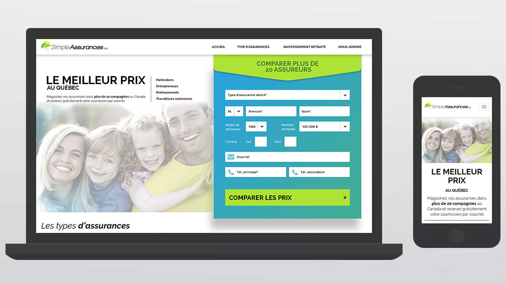
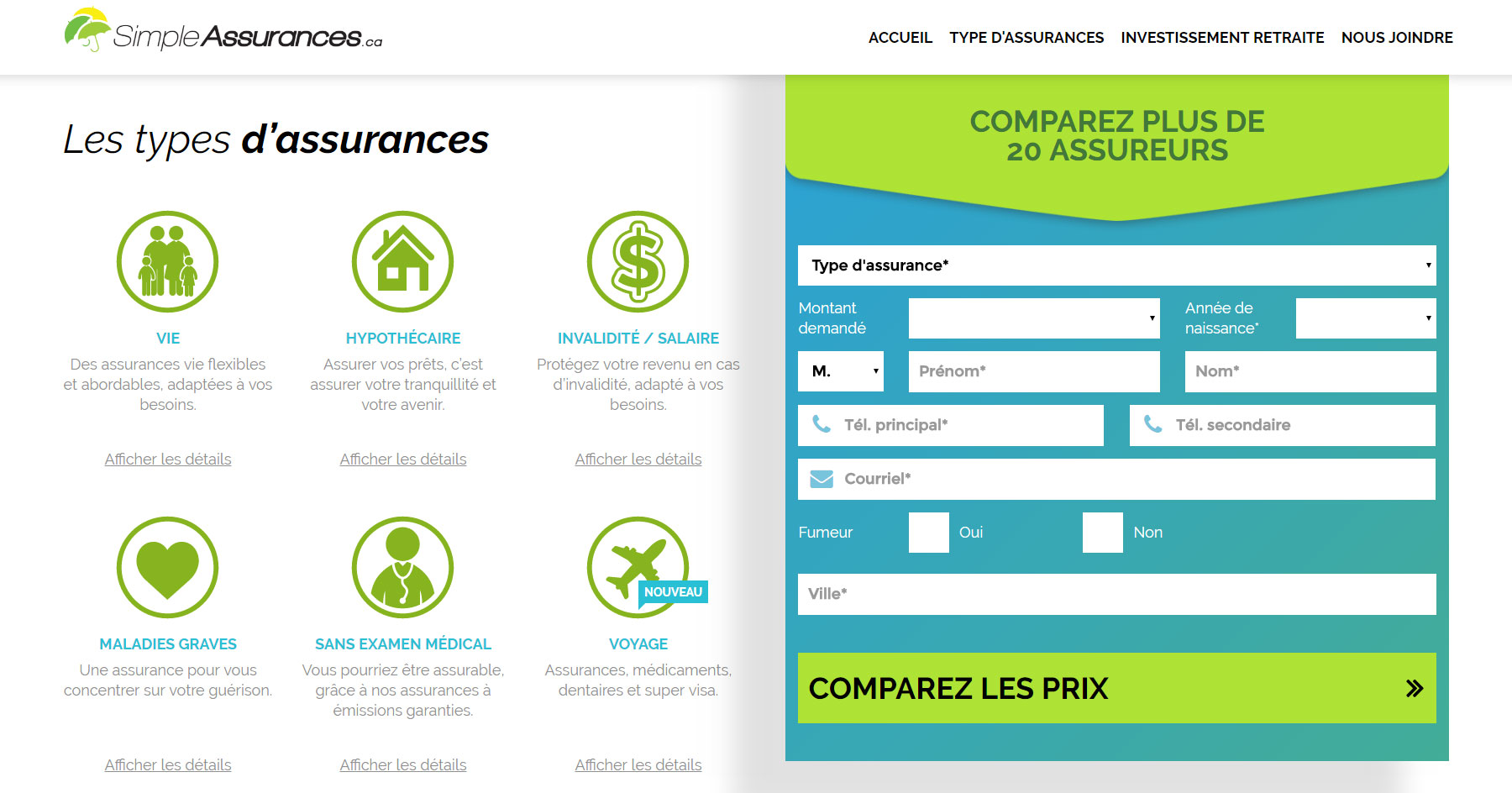
Part one of an ambitious project from Simple Assurances. Main goal, at this stage, was to collect user informations. This is why I aggressively focused the design on the form input, which uses up to 50% of the screen on desktop, at all time.
Client: Simple Assurances
Category: Website


